UX/UI CASE STUDY — 2024
ZenZap Wellness App
ZenZap is a mobile wellness app designed to help users manage stress, track emotions, and build healthier daily habits through a calm, supportive, and easy-to-use experience.
Role
UX/UI Designer
Timeline
2-Week Case Study
Overview
ZenZap began with a simple question: how can a wellness app support people without becoming another source of pressure?
The project focused on creating a calmer mobile experience for users who feel overwhelmed by stress, emotional overload, and habit-tracking tools that often feel too generic or demanding. The goal was to design something supportive, simple, and easy to return to daily.

Project Goal
Design a friendly, intuitive mobile experience that helps users manage stress, build small healthy habits, and feel supported without overwhelm.

Target Users
Young adults and busy professionals looking for emotional support, stress relief, and a more approachable alternative to traditional wellness apps.

Cluttered Visuals
Overloaded dashboards and feature-heavy interfaces made emotional check-ins feel more stressful than helpful.

Attention Hijacking
Frequent nudges, streaks, and gamified prompts often created guilt instead of calm.
The Problem
"Wellness apps have become just another source
of notification anxiety."
Research showed that many wellness apps rely heavily on streaks, reminders, and overly dense interfaces. Instead of feeling supported, users often feel pressure to perform wellness “correctly” or abandon the app entirely when the experience becomes too demanding.
The Solution
ZenZap was designed as a low-pressure wellness experience—using soft visual language, simplified flows, and emotionally supportive features that encourage consistency without overwhelm.
Calm-First Interface
Soft spacing, rounded components, and minimal UI patterns were used to make daily interactions feel lighter, quieter, and easier to navigate.

Soft Visual Language
Neutral tones and gentle contrast were used to create a sense of calm while keeping the interface clear and accessible.
Low-Pressure Engagement
The experience avoids aggressive nudges and focuses instead on optional check-ins, supportive prompts, and self-paced progress.
Core Features
Mood tracking, daily wellness challenges, supportive resources, and a buddy-style accountability feature were designed to make emotional care feel approachable and actionable.
Prototype Highlights
The prototype focused on simple, repeatable actions that help users check in, feel supported, and build healthier habits through a calm mobile experience.
Explore Key Screens

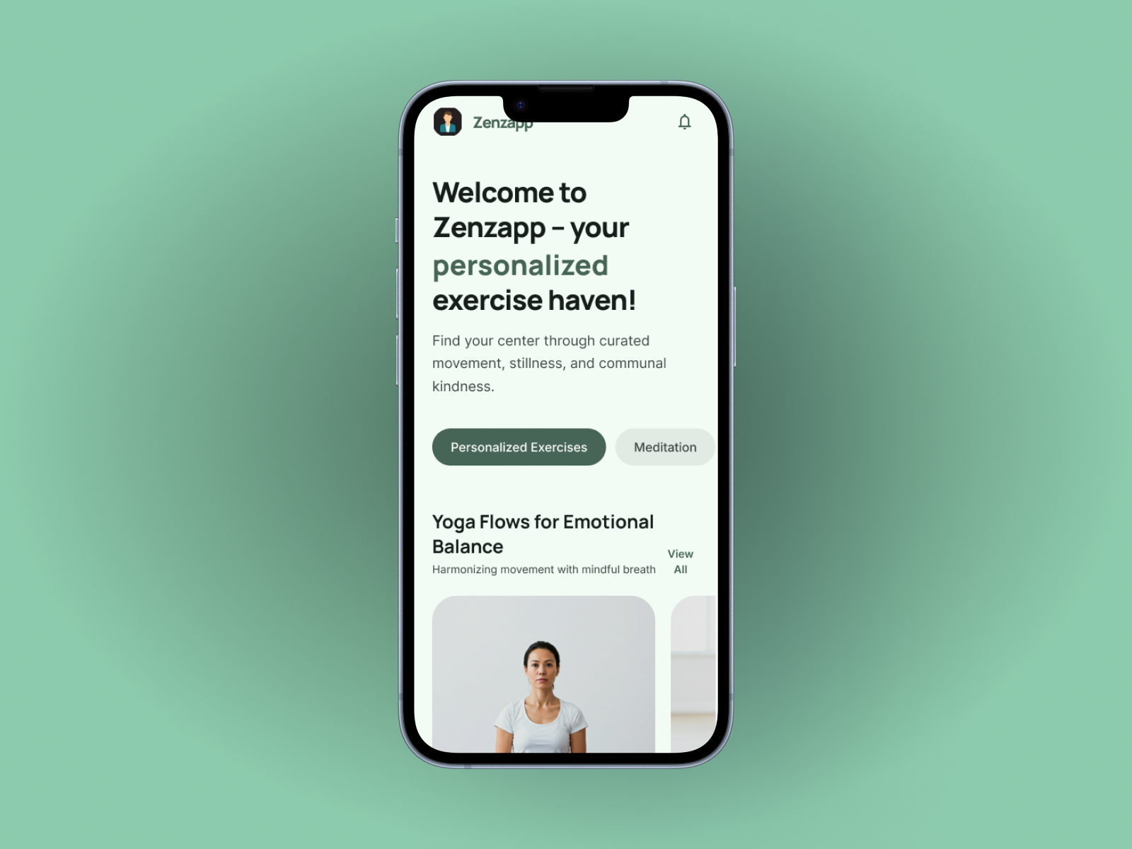
Mood Check-In Dashboard
A simple home screen that combines emotional check-ins with a suggested next action based on how the user feels.
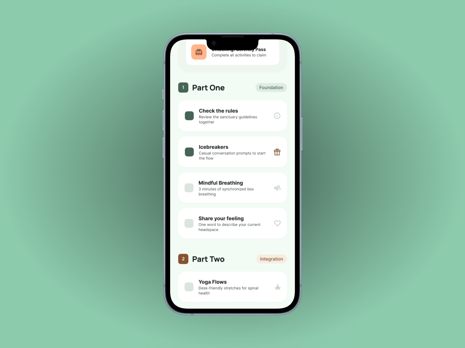
Kindness Challenges
Small daily actions designed to support emotional well-being through manageable, encouraging habits.
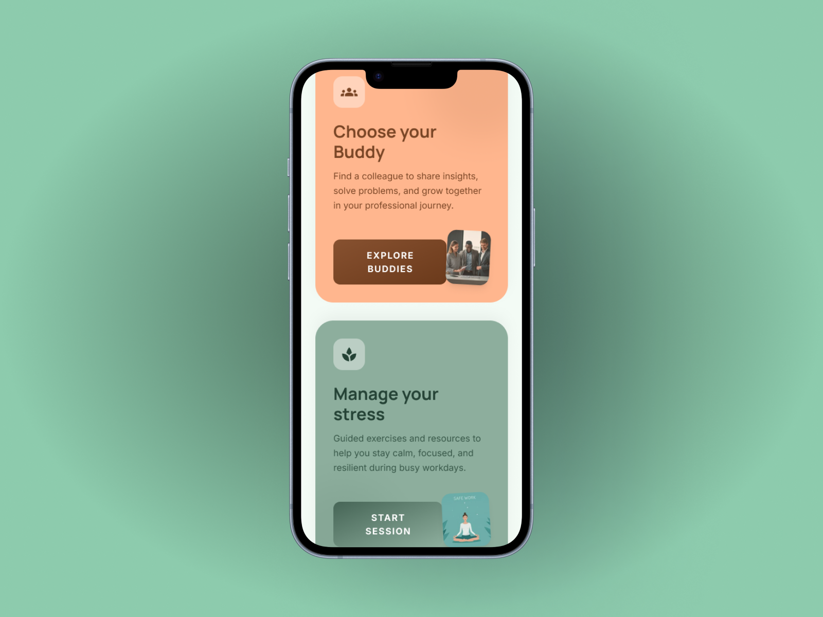
Buddy Pairing
A light accountability feature that helps users feel supported through anonymous or low-pressure connection.
Research & Process
The concept was shaped through lightweight research and rapid iteration, combining user input with competitive analysis to identify what makes wellness experiences feel supportive instead of demanding.
Surveys (30+ participants)
Users shared stress triggers, emotional habits, and expectations for a wellness app.
Competitive Analysis
Reviewed Calm, Headspace, and Woebot to identify strengths, gaps, and opportunities.
Wireframing to Hi-Fi
Moved from low-fi to mid-fi to high-fi to validate structure early before refining the visual tone.
Next:
Resume
